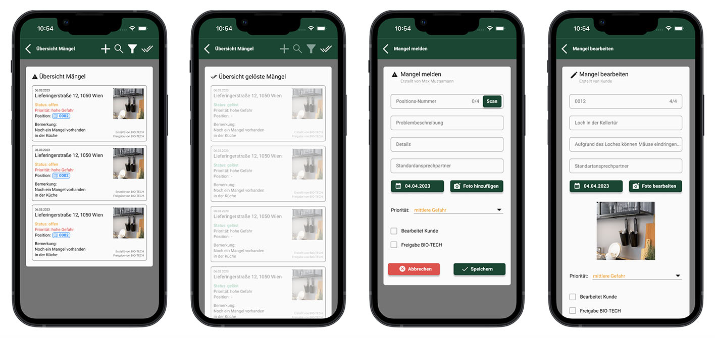
Self-Service Pest Control
Customers want to control traps by themselves without the need for a service employee.
The UX UI part took approximately 5 months, with two weekly meetings. The team included myself, a product manager, two customers who provided direct feedback, and an engineer. Our goal was to create an efficient solution for both customers and employees.
The Problem
In 2023, Bio-Tech's customers had to rely entirely on pest control services, meaning they were forced to pay for service visits even when triggered traps were false alarms. This led to unnecessary costs and frustrations. Employees, on the other hand, often had to travel long distances to reset traps, only to discover it was a false alert. The inefficiency increased operational costs and wasted time.
Our main question became: How can we include the customers in the app experience, allowing them to easy manage 1-100+ locations?
Exploration
One of the first things I did to get a better feel for the current app was to meet up with an employee and tag along. I wanted to see how he actually uses the app, checks traps in a supermarket, and talks to customers. This gave me a real sense of what works, what doesn’t, and where we could improve things.
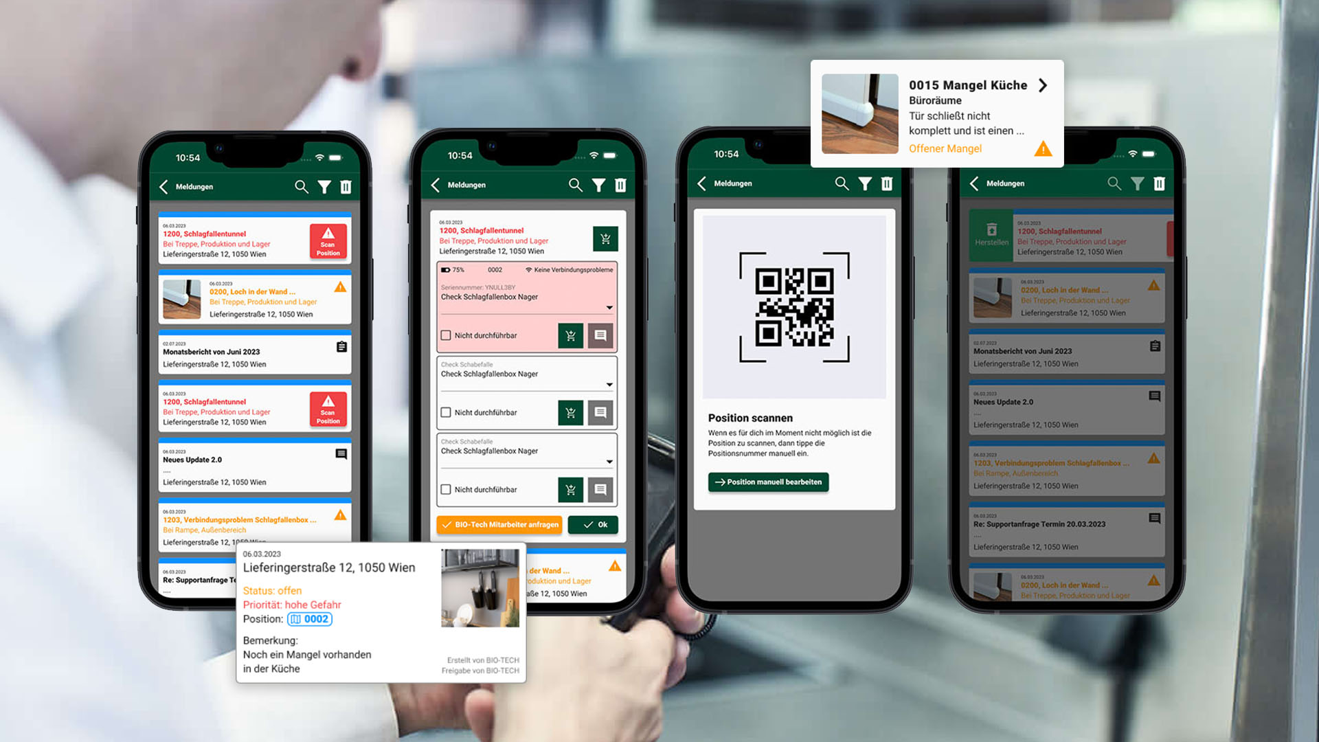
We explored ways to give customers more control over the pest management process without compromising service quality. The key insight came from the radio traps used by Bio-Tech, which are remotely triggered and managed through a system. This system allowed customers to control traps directly without generating automatic orders in SAP.
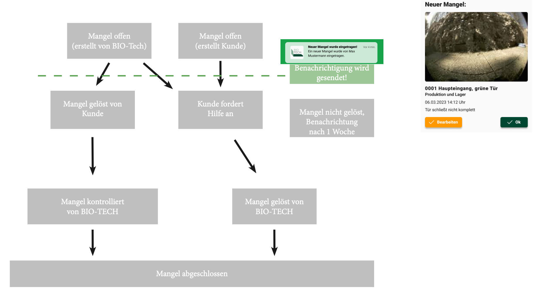
Previously, orders were generated only through SAP, either manually by employees or on a scheduled basis (e.g., a service order every other month). We realized that by enabling customers to handle trap resets themselves, we could reduce the number of unnecessary service calls.
We focused on:
- Providing notifications when traps are triggered
- Allowing customers to reset traps remotely
- Ensuring that service orders are only generated for actual, significant events
We also considered customers who manage over 100 locations (each with their own customer number). These customers needed a simple way to track which location had an issue and respond accordingly. Our design had to scale effectively for both small and large operations.
Scoping
We had to carefully define the functionality of the app to ensure it met the needs of both employees and customers while maintaining operational efficiency. Some key questions guided the scoping process:
For which traps may the customer act themselves?
Should this be limited to radio traps only, or all traps? We decided that for safety and consistency, customers would primarily control radio traps.
Can customers replace bait in mousetraps?
This was technically possible, but we needed to assess whether it should be allowed. After careful consideration, we allowed bait replacement as long as customers had the appropriate access level.
Can customers buy material through the app?
Yes, we introduced a feature allowing customers to buy materials such as bait and traps, but it was gated behind access levels to ensure only authorized users could make purchases.
Should photo messages be displayed in the trap detail view?
To avoid overwhelming users with too many photos, especially from false alarms, we implemented a solution where only relevant images were displayed. "Zero messages" (false triggers) were saved in the background but not shown to the customer unless necessary.
Should the app display a history of trap activity in case of a connection problem?
Yes, in the event of a connection issue, customers needed to see a history of trap activity. This feature was added to allow customers to diagnose and solve potential issues on their own, without the need for employee intervention.
The final scope prioritized giving customers sufficient control while minimizing the need for unnecessary employee involvement. We aimed for a balance between automation and manual control for both parties.
User Interface
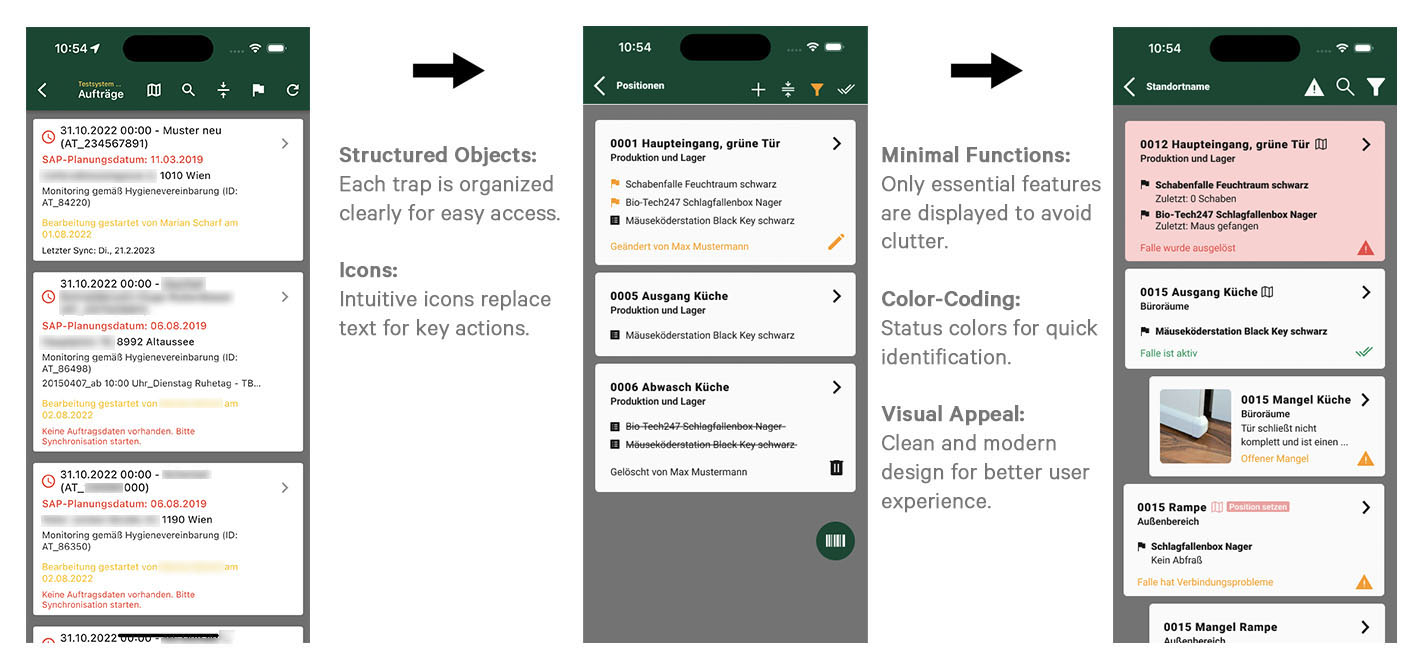
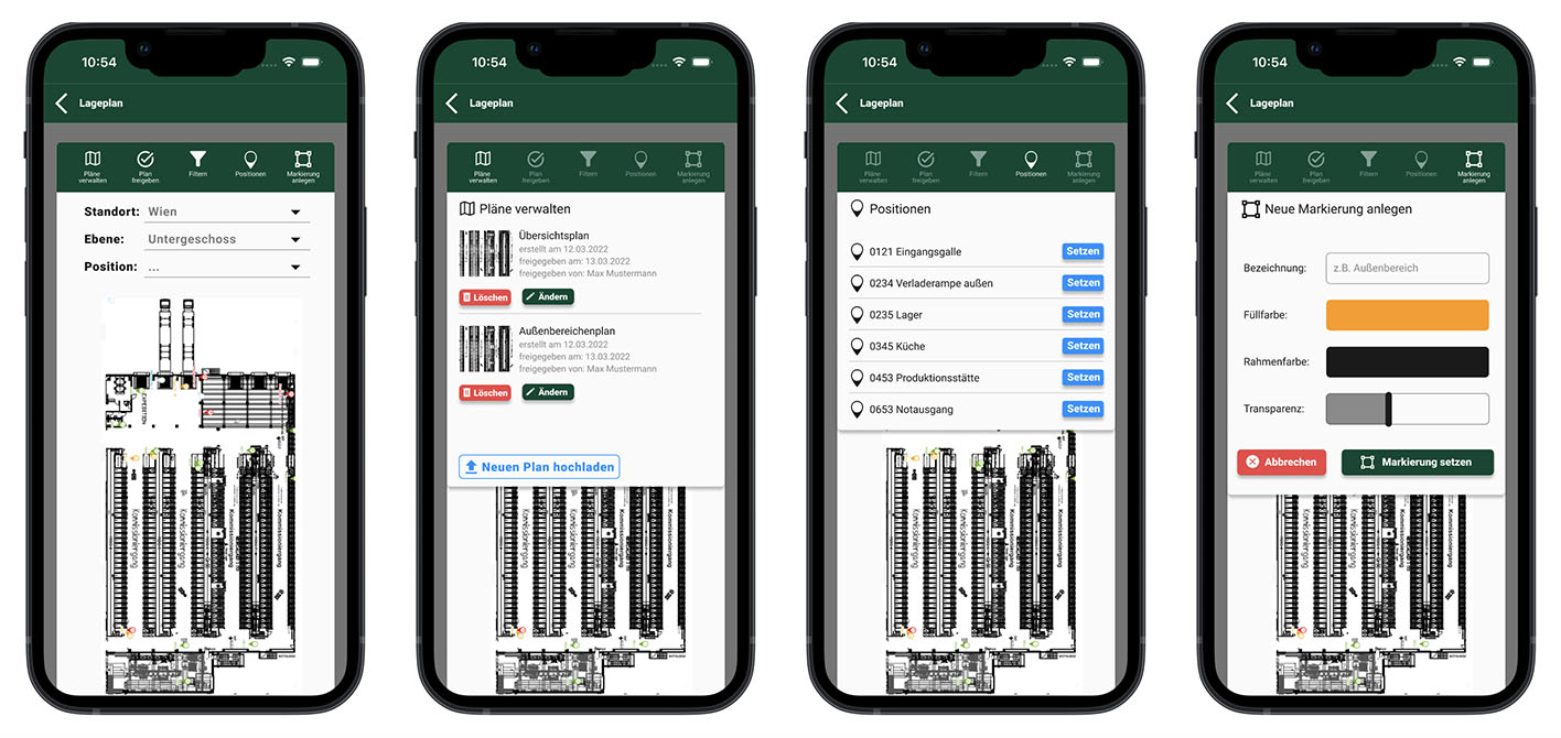
When it came to the user interface, there was already an existing employee app, so I had to first get familiar with its design principles. The challenge was that the design wasn’t very cohesive—there were inconsistencies in style and function. My first step was to understand what was already there and replicate it in a way that made sense. I created a design guideline for myself, laying out clear rules and patterns to follow moving forward. This not only helped me stay consistent but also made it easier to add new features as they came up during the project.
As more functionality was requested throughout the process, I introduced more flexible elements into the design. This allowed us to scale the app and easily add new features without breaking the overall flow. I also worked closely with the engineer to ensure that the designs were practical from a technical standpoint, making sure the interface was not only user-friendly but also efficient to build.
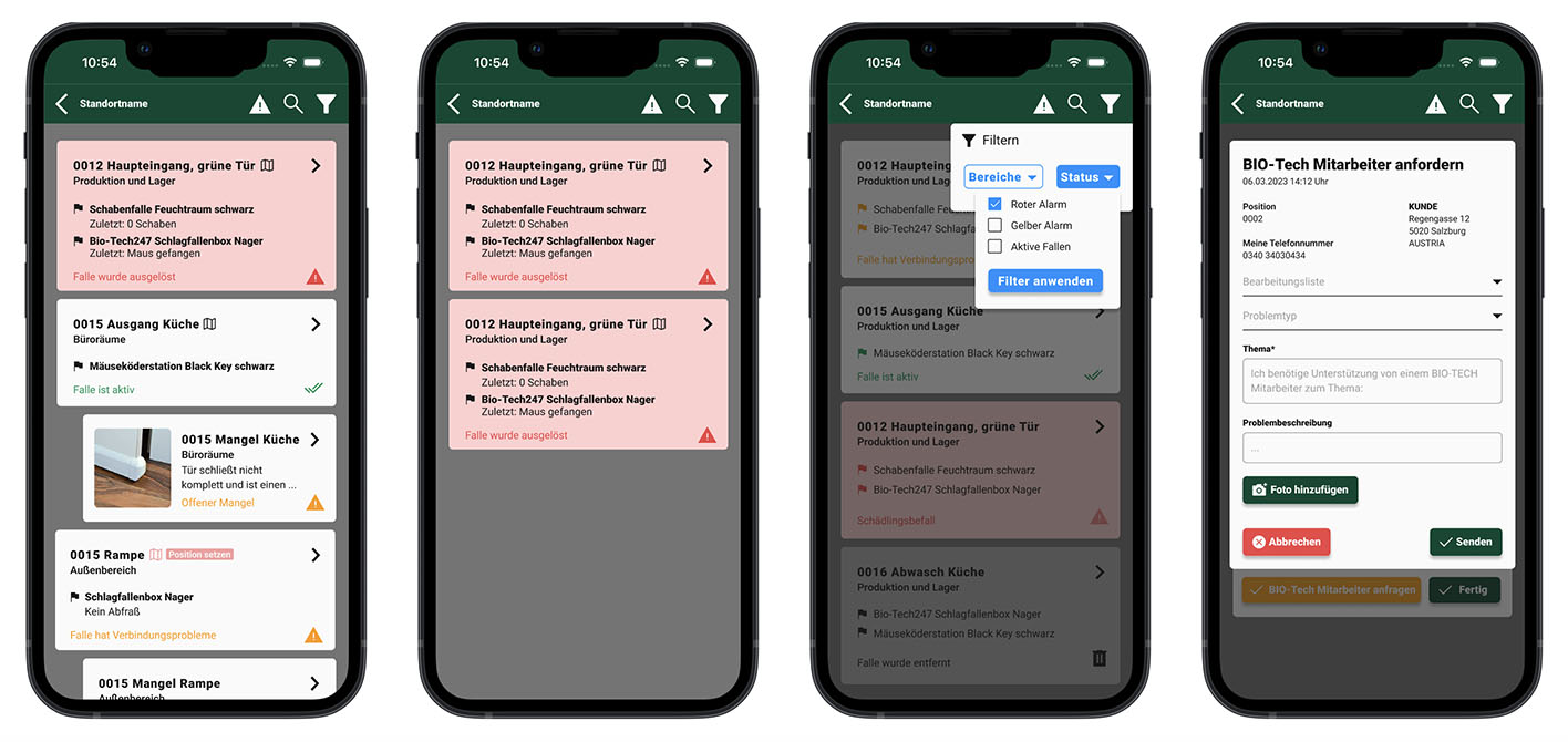
We kept the design clean and neutral, using color accents to differentiate between different booking states (e.g., new bookings, errors, confirmations). The goal was to make sure landlords could quickly see what was happening with their rentals without getting lost in the details. The calendar was central to the design, giving landlords an at-a-glance view of their bookings, availability, and any important alerts.
To keep things simple and user-friendly, we focused on straightforward navigation and clear visuals, making sure even non-tech-savvy users could easily manage their properties.
